
This toolkit is intended to give you some ideas on ways to analyse your survey and make it useful for those to whom you present it.
You don’t have to be ‘good at maths’ and certainly not a statistician to be able to turn your survey results into useful information. However, if you can find someone in your breed who is confident in handling data and presenting numerical results, that will probably be useful.
This is likely to be the most time-consuming part of any survey because you need to ensure that the results you eventually present are accurate and meaningful.
If you are using an online survey tool, this can save you some time because it may have an analysis and reporting function built in. If it doesn’t, you will almost certainly have to download the data in a format that you can then analyse in a spreadsheet or database.
IT tools to support your survey
In this toolkit we can’t teach you how to use specific software, so if you’re not able to create a survey yourself, or to analyse the results, you will need to find someone who is IT literate to help you.
Whatever type of survey you decide to conduct, you are going to need some software to collate and help analyse the responses. Your options really fall into two groups of software:
Whatever type of survey you decide to conduct, you are going to need some software to collate and help analyse the responses. Your options really fall into two groups of software:
- desktop software that you have installed on your computer
- online software that you access via the internet
Desktop software
Most people with a PC or Mac will have access to either a spreadsheet or a database. While there is dedicated survey software available, for most people it will be too expensive or too specialised. The most commonly available desktop programs are:
Most people will have one of the Microsoft Office suites on their computer and, providing you are reasonably proficient, their spreadsheets can be used to carry out quite sophisticated analyses. Their databases are potentially more powerful in terms of the level of analysis that you can carry out, but the downside is that they can be more difficult to learn to use than a spreadsheet.
With your survey results in a spreadsheet, it’s easy to use the in-built data functions to produce summaries of, e.g.:
| Windows PC | Apple Mac | |
|---|---|---|
| Spreadsheet options | Microsoft Excel Open Office Calc |
iWork Numbers Microsoft Excel Open Office Calc |
| Database options | Microsoft Access Open Office Base Filemaker Pro |
Filemaker Pro Open Office Base |
Most people will have one of the Microsoft Office suites on their computer and, providing you are reasonably proficient, their spreadsheets can be used to carry out quite sophisticated analyses. Their databases are potentially more powerful in terms of the level of analysis that you can carry out, but the downside is that they can be more difficult to learn to use than a spreadsheet.
With your survey results in a spreadsheet, it’s easy to use the in-built data functions to produce summaries of, e.g.:
- How many dogs had a particular health condition
- How many dogs had no health issues reported
- How many dogs died
- What was the average age of death
- What proportion of dogs had been bred from
- Whether there was any difference between the health issues of dogs and bitches
Analysis
There are three main concepts you may need to use when analysing your survey data:
- Averages
- Variation
- Trends
Averages
‘What do we mean when we use the phrase “average”? The reason we should ask this is because there are several different types of ‘average’.
The most commonly understood average is the mean, which is calculated by adding up all the data values and dividing by the number of data points. e.g. if 10 dogs die at the following ages we can calculate their average age of death:
Dog 1: 6
Dog 2: 6.5
Dog 3: 7
Dog 4: 7
Dog 5: 7
Dog 6: 7.5
Dog 7: 8
Dog 8: 8
Dog 9: 10
Dog 10: 13
The mean age of death of these 10 dogs is 8 (add up all the dogs’ ages and divide by 10).
A second type of average is called the median and it is this value that has usually been quoted when the results of the 2004 KC/BSAVA health survey are reported. The median is the middle value of all the data points when they are listed in order from smallest to biggest. So, in our example above, the median is half-way between the fifth and sixth dogs’ ages, which in this case is 7.25.
A third type of average is the mode, which is the most commonly occurring value in the set of data.
In our example, the mode is 7. As you can see, it’s possible to get different answers depending on which ‘average’ you calculate.
Tip: most of the time, the mean is perfectly fine and is what most of your readers would recognise as the ‘average’.
Sometimes, if your data include some extreme values, e.g. puppy deaths, using the mean would skew the average to a lower value and therefore the median would be more meaningful.
Variation
In addition to knowing the average (e.g. age of death or litter size) it’s often helpful to tell people something about how much variation there is in the data. The simplest measure of variation is the range: the difference between the highest and lowest values. In our example above, the youngest dog died at 6 and the oldest at 13; a range of 7 years, albeit in a very small sample.
Trends
If you are in the fortunate position of having done several surveys over a number of years, you will be able to present the trends that exist. Trend data tells you whether something is getting better, getting worse, or not changing at all. e.g. you might be interested in finding out if the number of people using a DNA test is increasing year on year, or if litter sizes (and fertility) are decreasing over time.
Tip: Information on trends is really important because it will tell you if you need to be taking action, or if the actions you are taking are working.
Tip: Information on trends is really important because it will tell you if you need to be taking action, or if the actions you are taking are working.
Data presentation
Only two choices about how to present your survey results are available:
- Tables of data
- Graphs/charts
Tips for tables
Put the biggest numbers or the newest year’s data at the top and use vertical lists, rather than horizontal ones, as these are easier for the eye to scan downwards and make comparisons.
e.g. in this table:
e.g. in this table:
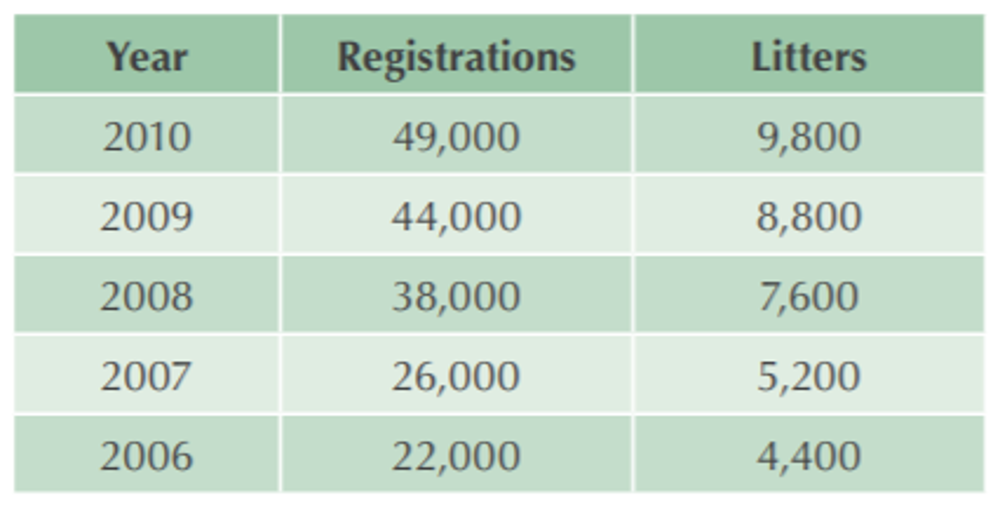
Very few people need absolutely accurate numbers, so it’s usually easier to look at if you can present numbers in a rounded form. In the previous table, we have rounded the numbers. It’s then easier for people to do mental arithmetic (e.g. it’s quite easy to see that average litter sizes have remained around five over the five years).
Provide row/column averages or totals to help focus attention and also include a verbal summary to help your readers.
e.g. you might summarise, from this table:
Provide row/column averages or totals to help focus attention and also include a verbal summary to help your readers.
e.g. you might summarise, from this table:
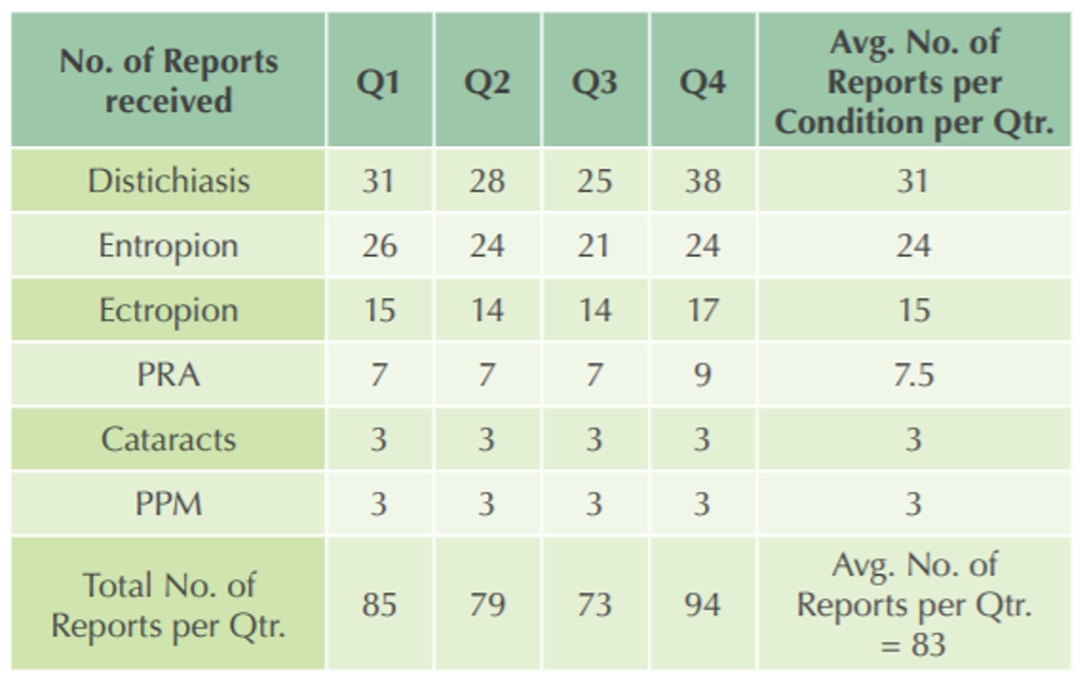
“On average we receive 83 reports on eye conditions each quarter. Of those, the most common are distichiasis and entropion, with an average of 31 and 24 reports per quarter each, respectively.”
Graphs and charts
Here are some of the commonly used types of chart, all of which can be created easily using MS Excel, Mac Numbers or Google Spreadsheets.
- Pie chart
- Bar chart
- Histogram
- Line graph
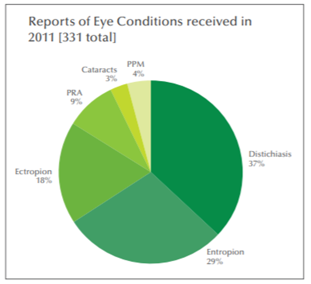
Pie chart
The data points in a pie chart are displayed as a percentage of the whole pie.
- Good for: showing proportions, at a glance
- Not good for: showing trends or comparisons over time
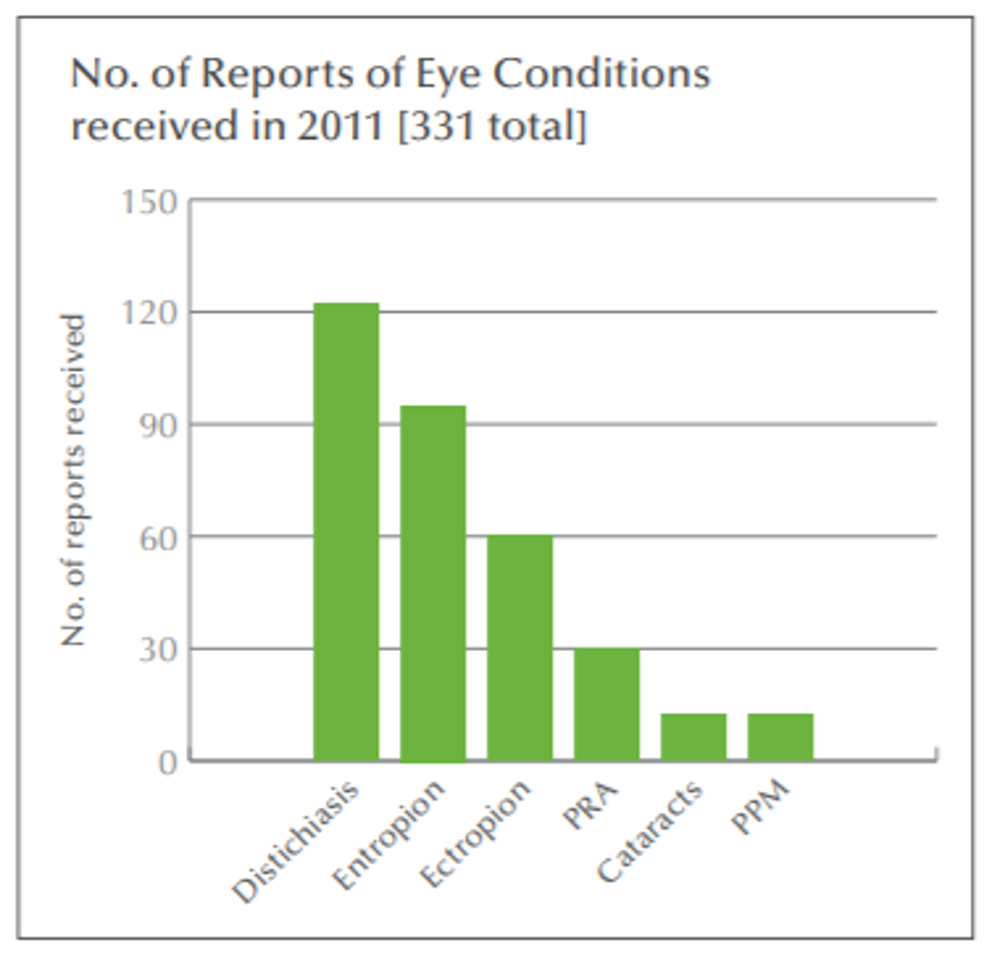
Bar chart
In bar charts, categories are typically organised along the horizontal axis and values up the vertical axis. Bar charts illustrate comparisons among individual items, but do not show proportions as in a pie chart.
- Good for: showing quantities of responses in different categories; often best when sorted into biggest to smallest
- Not good for: showing data over time (use a line graph instead)
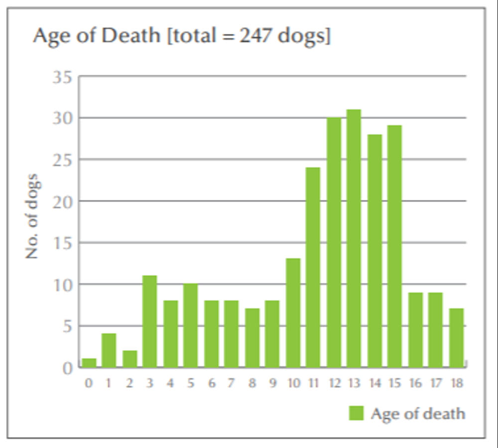
Histogram
In histograms, a variable (e.g. age) is displayed along the horizontal axis and frequency up the vertical axis.
- Good for: showing the variation in a set of data and to help decide if the mean or median are the best choice of average to quote
- Not good for: showing variations over time
Line graph
In a line graph, time data are distributed evenly along the horizontal axis, and all value data are distributed up the vertical axis.
- Good for: showing how results have changed over time (trends)
- Not good for: comparing lots of different sets of results (too many lines make it hard to see what’s going on)
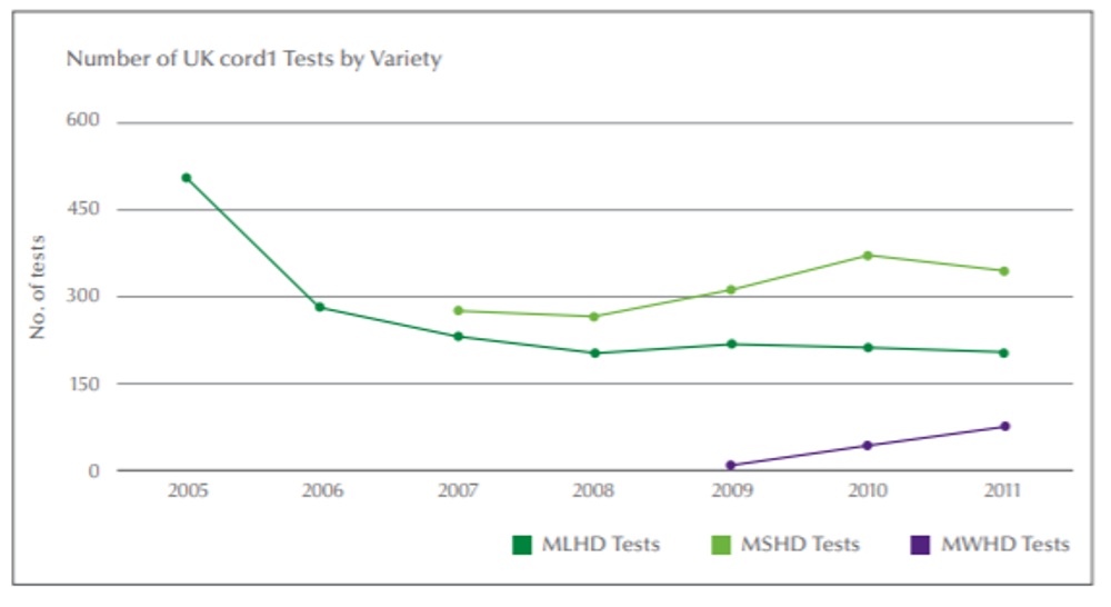
In this example, you’d need to explain that MSHD and MWHD testing had started in 2007 and 2009 respectively, otherwise people might wonder why there are no results for earlier years.
Tables and graphs are the two main ways for you to present the results of your survey.
Use tables when you have 10 or fewer data points, or if you need people to see the exact numerical values in your results.
Use graphs when you have more than 10 data points, or if you want to show people “the big picture”, not detailed data. Don’t clutter a graph with too many different sets of data; it’s usually better to split the data into separate graphs.
Tip: Tables and graphs should have clear titles and a written commentary to help your reader draw conclusions.
Remember, your data may be complex, but your presentation should be simple.
What are your survey responses telling you?
Crunching the numbers and producing charts or tables of data are only part of your analysis. The next step is to make sense of them and draw conclusions about what actions your breed might need to take.
In a toolkit like this we can’t tell you what conclusions to draw from your survey. However, you might find any of the following:
In a toolkit like this we can’t tell you what conclusions to draw from your survey. However, you might find any of the following:
- Health concerns that you weren’t previously aware of
- Health issues that are either more, or less, prevalent than you previously suspected
- Confirmation of anecdotal evidence of health problems
- Confirmation that the health plans you already have in place do reflect the real priorities
- Evidence that actions you have already taken with health plans are making a difference
Identify actions to take
Three golden rules apply to health surveys:
Tip: Don’t try to tackle every health issue at once! There is some value in starting with something that is doable, so that you can gain support and confidence from a wide group of breeders and owners.
The actions you plan to take will depend on a number of factors:
- No measurement without recording
- No recording without analysis
- No analysis without action
Tip: Don’t try to tackle every health issue at once! There is some value in starting with something that is doable, so that you can gain support and confidence from a wide group of breeders and owners.
The actions you plan to take will depend on a number of factors:
- The severity and impact of any particular health condition in your breed
- Whether or not any clinical or DNA screening tests are available
- The prevalence of the condition in your breed
- The genetic diversity of your breed
- How quickly a condition can be tackled (without adversely affecting genetic diversity)
- How easy it is to educate and inform breeders about health issues and solutions
Writing up your results
Once you have collected and analysed your results you will need to present your findings in a survey report. The purpose of this document is to tell readers, who may be unfamiliar with your survey, what you found, how you found it and what these findings mean. The report will need to follow a logical order, which you may want to organise into several well-defined sections, such as:
- Executive summary (a condensed description of your work and its findings)
- Contents page
- Introduction (why you decided to carry out the survey and any relevant background information)
- Methodology (how you carried out your survey)
- Results (what you found)
- Discussion and conclusions (what you think your findings mean and what your next steps are.
Executive summary
This may be one of the most important parts of your report. Some people may not have time to read the entire document (despite all your hard work) and so a brief summary can give them a clear idea of what the report is about. The executive summary should be short (no more than one page), but should cover the objectives of the survey, how and why you carried out your survey, the highlights of your results, your conclusions and recommendations.
Tip: Write the executive summary after you have written the rest of the report. Read through each section and highlight 2-3 key sentences that summarise that section, then combine these into a paragraph.
Tip: Write the executive summary after you have written the rest of the report. Read through each section and highlight 2-3 key sentences that summarise that section, then combine these into a paragraph.
Contents page
This lists the major sections of the survey report and the page numbers for where in the report you can find them. Don’t forget you can list any appendices, such as the survey itself, which have not been integrated into the body of the report.
Introduction
This provides readers with an overall background and should state the purpose, goals and objectives of the survey. You should mention what inspired the survey and what you hoped to learn. If you are investigating specific health problems, you may want to describe the significance of the problem and its impact, if known, on your breed. You could also include any background data, e.g. if any similar surveys were carried out previously, and what was found.
Methodology
Here you should describe exactly how you carried out the survey and how you obtained your results. You may want to include information on the dates when you sent out your first survey and when the last one was collected. Which groups of people did you send the survey to and how did you do this? Was it sent out by post, email or was it an electronic questionnaire? How did people find out about your survey? What did you do with the results once you had collected your responses and how did you analyse them?
Results
The purpose of this section is to present and illustrate your findings. Make sure this is done in an objective way and only present the facts – save your interpretation of the data for the discussion and conclusion. The results should be organised around the major sections of the questions asked. You may want to state each survey question and then give a summary of how people responded. Percentages are a great way to show the results obtained. It may be useful to say how many people responded to each question and then show a percentage for each response, e.g. “355 people responded to the question ‘How many dogs do you own?’, of which 55% had one, 25% had two and 20% had three”. You can also use graphs or tables to illustrate your findings.
Tip: Be careful not to present the same data more than once. If you give information in a table or as text, then you may not need to show it again in a graph.
Graphs can be a very useful tool for showing results, but remember that they can take up a lot of space, so do not overuse them in a report. If you include a graph, make sure everything is clearly labelled, including axis, units and values. Make sure to give the graph a heading that summarises what it shows. If using a table you could write a brief summary which highlights the main points of the table. Don’t overdo it: readers can always look at the details in the table if they want to.
Tip: The use of colour in graphs is helpful, but remember that your report may be printed in black and white, or photocopied, so you may want to use patterns or choose colours that can easily be distinguished when displayed in greyscale, e.g. light blue vs. dark red.
If any of your questions required a free-text response, then organise and summarise the respondent’s views. e.g. “501 people responded to the question ‘What concerns you most about health of your breed?’, 58% (252 respondents) said they were concerned about eye problems, 30% (149 respondents) hip conditions and 20% (100 respondents) heart conditions”. You can quote directly from some of the survey responses, but only if they clearly illustrate a view representative of the respondents.
Tip: Report the data without any “spin”. Surveys are meant to be objective, so present the information as it stands.
Discussion and conclusions
The objective of this section is to highlight your findings, interpret the results and draw a conclusion. In this section you can mention what was learned from the survey, supporting statements with data from your results section, e.g. “most dogs (82%) were found to be healthy”.
State all of your major findings and what they mean. If your results differ from your expectations, explain why that may have occurred. If your results agree, then explain why this was. You may suggest future directions, such as questions you may ask in future surveys. Also, indicate if the overall goals and objectives were met and if there will be follow-up surveys in the future.
State all of your major findings and what they mean. If your results differ from your expectations, explain why that may have occurred. If your results agree, then explain why this was. You may suggest future directions, such as questions you may ask in future surveys. Also, indicate if the overall goals and objectives were met and if there will be follow-up surveys in the future.
Appendices
It’s good practice to include a copy of the blank questionnaire so that people can see how it was structured – even though you may have already given the wording of each question individually in the body of the report.
Publicise the results
No doubt, when you initially told people about your plans for a survey, you promised that the results would be published. If you want people to help you with future surveys you have to be open and honest with the results and make them freely available. You also need to tell people what your club/council intends to do to address any issues that have been identified in the survey.
The most obvious way to publicise the survey’s results is through a report which you can make available as a document download from your club/council website health pages. You could also use the results to create specific web pages on individual health conditions, where you explain the
condition, its symptoms and what the survey tells you about the condition in your breed.
Tip: Think about opportunities to use the survey results as part of your breed’s regular communication on health. e.g. you could publish a sequence of articles monthly, based on survey results for different health conditions.
If you’re using social media, you can achieve much wider publicity for your survey results through Facebook, Twitter and discussion groups. Don’t forget the specialist dog press and monthly pet magazines; if you’ve got a good news story, send them a media release or a short article and ask if they will publish it.
Tip: Look for as many different online options for publicising your survey results as possible, as well as the more conventional paper-based options such as breed club newsletters.
Implement your priority actions
The overall purpose of any survey is to enable a breed to achieve further health improvement, or to begin to address any emerging health issues. We all know that breed health improvement is not going to happen overnight - you need to set realistic expectations about what you plan to do and how quickly you can do it.
Review and repeat the survey
A breed health survey will help provide a lasting benefit and will set the direction for continuous health improvement. To achieve this you will need to:
By carrying out a regular survey you will be able to compare trends over time. Ideally, annual surveys would be performed, but this does require a significant amount of time and effort and you may find that it is more practical to repeat your survey every two or three years. Alternatively, you may want to consider making a continuous survey available so that data can be gathered throughout the year.
Tip: If you implement a continuous online survey, you can publish a summary of the results in your breed’s annual health report.
- Review progress to ensure your health action plans are being implemented
- Identify what you have learned about doing a survey and improve the way you do it next time
- Repeat your survey at regular intervals
By carrying out a regular survey you will be able to compare trends over time. Ideally, annual surveys would be performed, but this does require a significant amount of time and effort and you may find that it is more practical to repeat your survey every two or three years. Alternatively, you may want to consider making a continuous survey available so that data can be gathered throughout the year.
Tip: If you implement a continuous online survey, you can publish a summary of the results in your breed’s annual health report.
Acknowledgements
We wish to thank the following people for their help in developing this toolkit: